Engineering brought us a demo, and it was a good one. A real model, wired to the clinical study: describe the rule you need in plain language, and working rule code comes back. The pitch was hard to argue with — our users don't know how to code, so now they don't have to.
My first thought was: don't have to do what, exactly?
The code still lands on someone's screen, and someone still has to accept it. Are we expecting a person who has never written a line of JavaScript to read that and say yes?
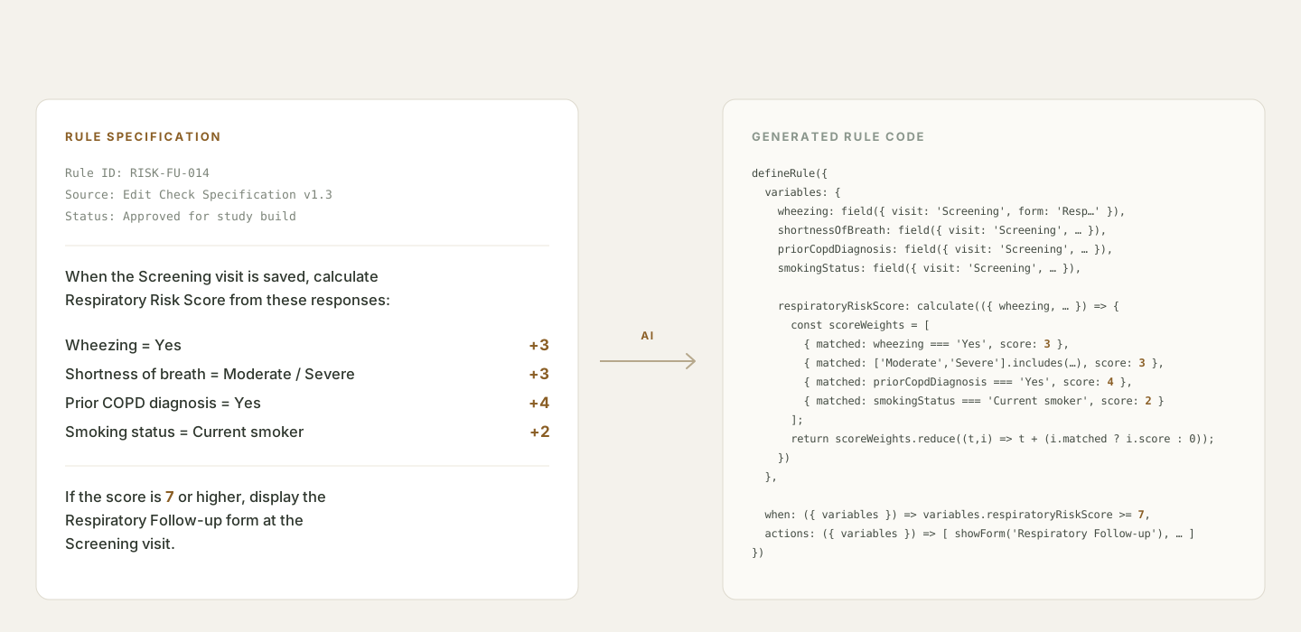
The people doing this work are Study Designers. They rarely invent a rule at the keyboard — they take a specification that has already been written and reviewed, and make it run in the product.
When a rule got complex, the logic had to be written as code, usually by someone else. That dependency is why generating the code looked so valuable. It is also why generating it created a new problem.
Code that runs is not code you can trust. It still has to read the right answers, change the right form, and behave when an answer is missing. Reading the code to check is a poor option for someone who needed help writing it.
So the question I designed against was never "can AI write this rule." It was: how does the person responsible for the rule find out what it does?
What I designed · Checkpoint 1
Show what the AI understood, in words the team already uses
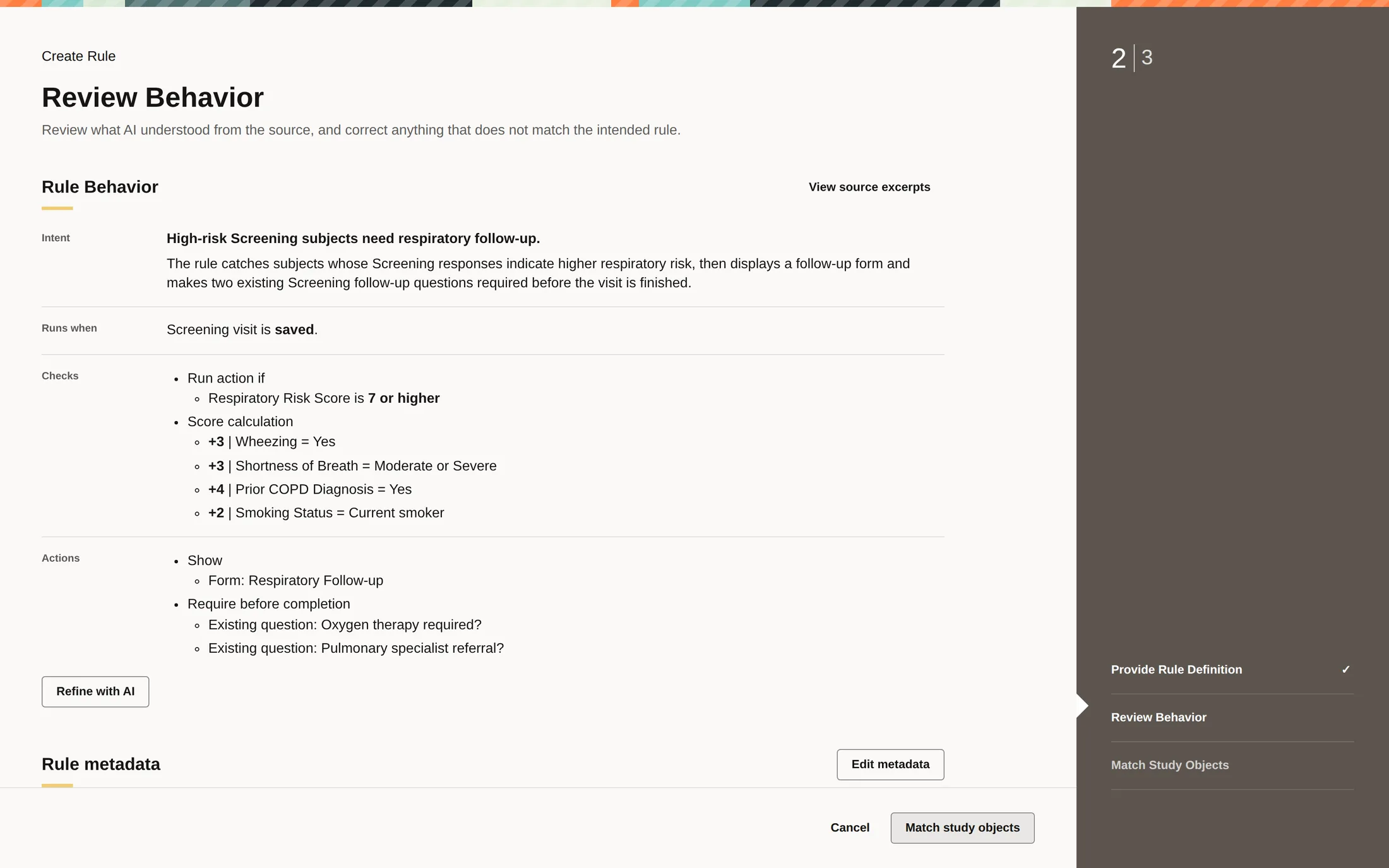
The specification is the one document everyone on the study team can already read. So the assistant's first output is not code. It is the same rule, written back as behavior: when it runs, what it checks, what it changes.
If it misread the threshold, or attached the rule to the wrong event, you find that here — in a sentence you can argue with. You cannot argue with a line of JavaScript you did not write.
This is also the cheapest place to be wrong. A misunderstanding caught here costs a sentence. Caught after the rule is live, it costs a study.
What I designed · Checkpoint 2
Seven matches were right. The eighth stopped the work.
Describing a rule correctly is not the same as pointing it at the right data.
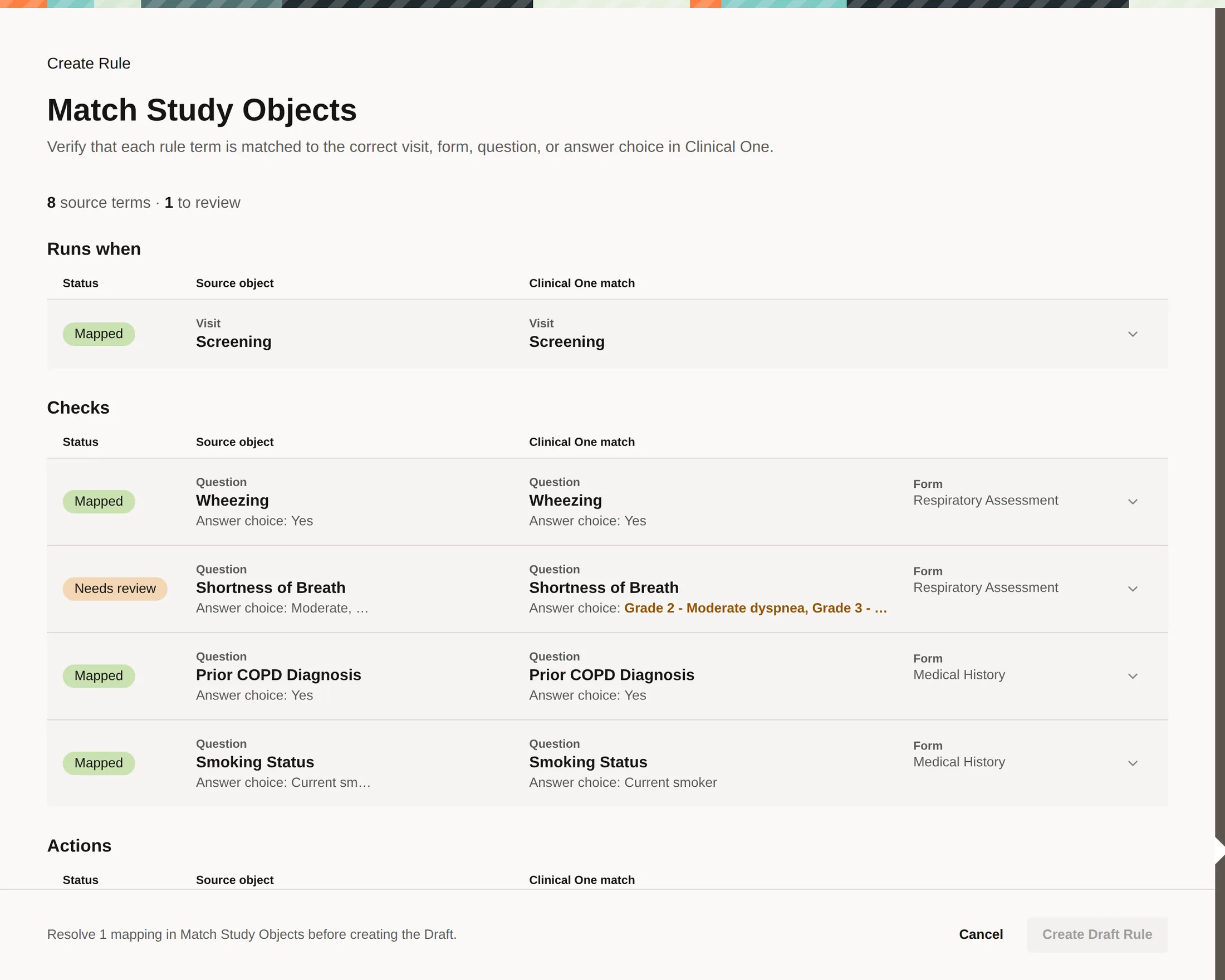
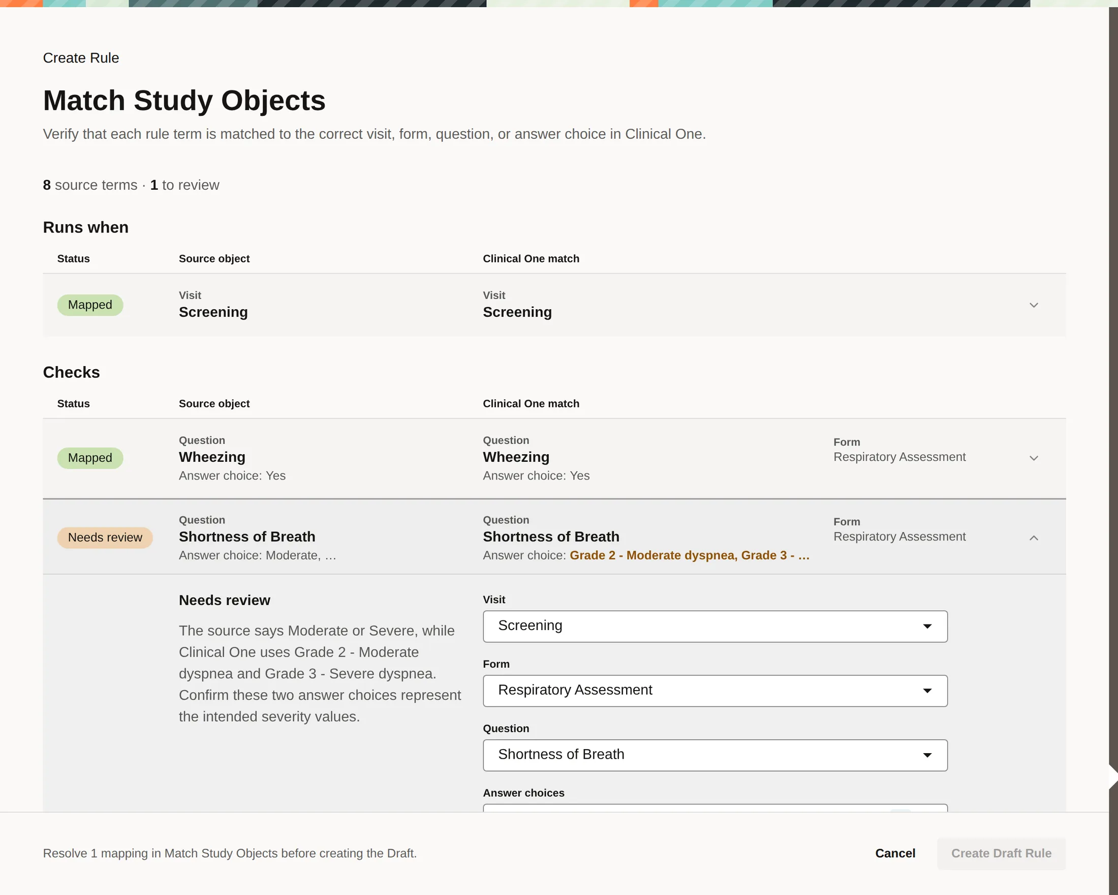
"Moderate or Severe" is a phrase in a document. In this study it has to land on two specific answer choices, on one question, on one form. The assistant found a match that was probably right.
Probably is not something you build a study on. And it is not a doubt the model can settle by re-reading the sentence — only someone who knows this study can.
So I made the unresolved match stop the work. The draft cannot be created until a person confirms it.
That cost falls on the wrong person. It blocks someone who came here to move faster, and it trusts the assistant to flag the right matches: a false flag wastes their time, a missed one passes in silence.
I took the trade because the two failures are not equal. A blocked draft is visible and annoying. A wrong match is invisible — the rule runs, the screens look right, and the study collects the wrong thing for a year.
What I designed · Checkpoint 3
Understanding a rule is not the same as watching it run
Checking what the AI understood still tells you nothing about behavior. To see behavior you have to run the rule, so I designed two ways to run it: one the system prepares for you, one you drive yourself.
Running it used to be a project of its own. The request we kept hearing was small — let me open the visit I care about and test there. The old testing mode made you build a simulated participant and work through the earlier steps first.
Then the real work started. You had to invent the cases yourself: the obvious high-risk answer, but also the blank input, the score exactly at the threshold, the follow-up questions left unanswered. And remember what each one did.
Let the system propose the checks — and say what each one proves
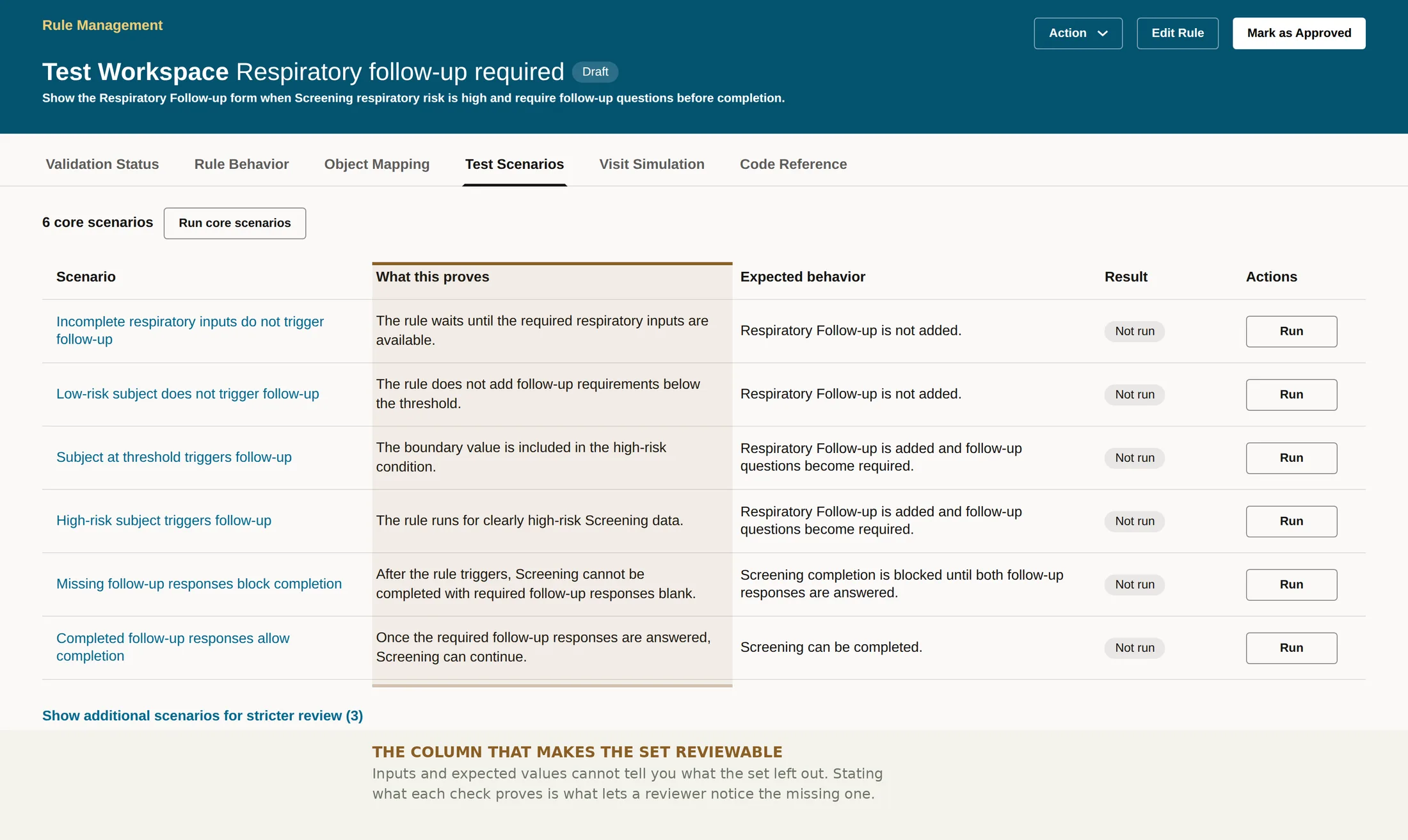
The middle column is the part I care about. A generated set of test cases is only as trustworthy as your ability to see what it left out, and inputs and expected values do not show you that. Stating what each check is for does.
It also keeps the assistant honest about its own authority. Every expected behavior in that table is the assistant's claim, not a verdict. It comes from the same reading of the specification that might have been wrong two sections ago.
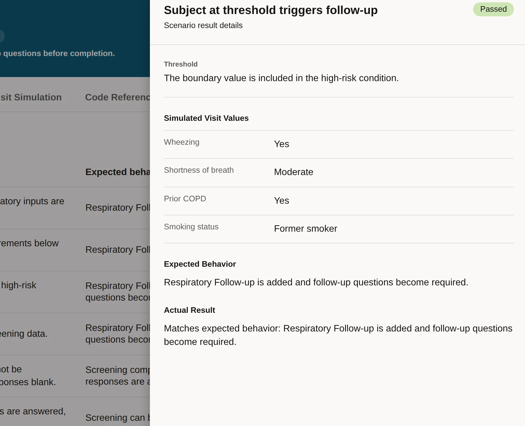
Let people change an answer and watch
Prepared checks cannot cover the doubt someone has about their own study. The second route drops them into the real study forms, as a site user sees them, and lets them try it.
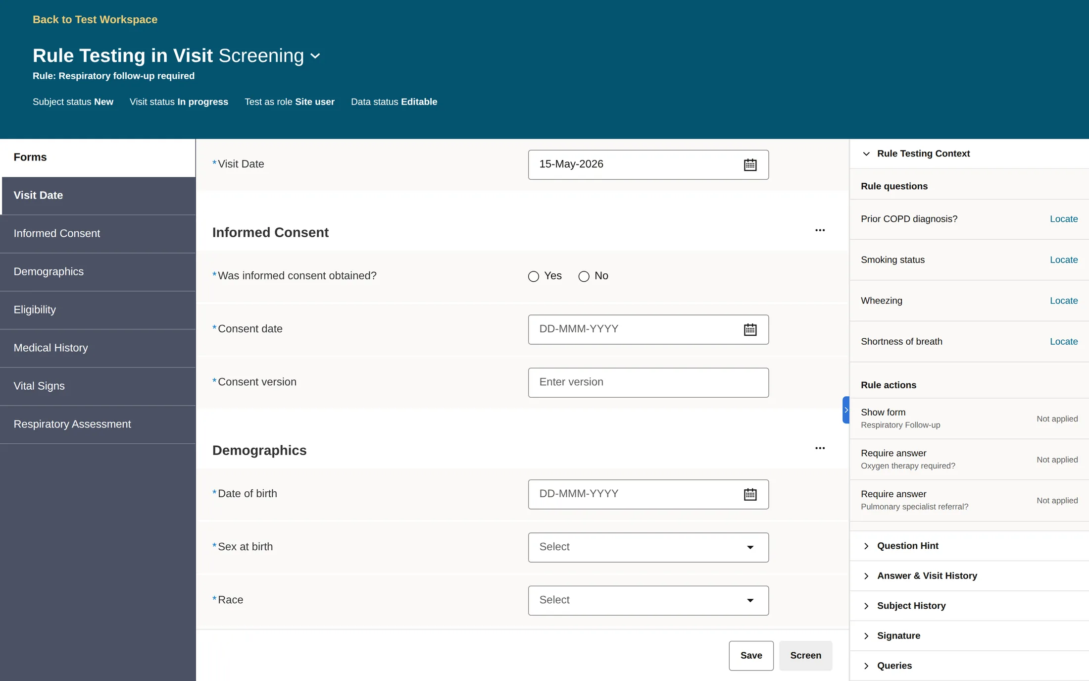
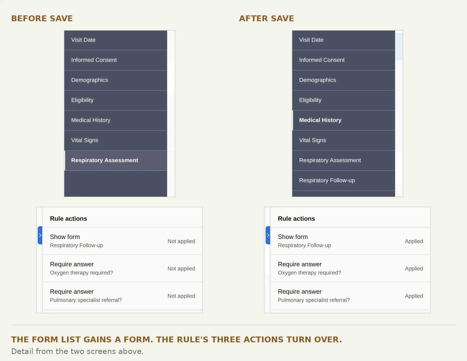
Two routes is more to learn than one, and I did consider shipping only the prepared checks. I kept both because each is weak exactly where the other is strong.
The prepared set is repeatable but can never prove it is complete. The simulation can try anything but proves nothing twice and leaves no record. Someone deciding whether to trust a rule needs both.
The constraint
Then the release got smaller than the design
The direction had support. The first release did not have room for it.
Engineering capacity went to generation. The testing workspace did not make it in.
There was a harder limit underneath that. The assistant's first release could create only a narrow set of rule actions — one action per rule, and not the ones that show a form or make a question required.
That rules out the example running through this case. Show a follow-up form, make two questions required: precisely the kind of rule the first release could not yet create. Widening the range was treated as a separate feature.
So the question changed under me. Not "what is the best way to check a rule," but "with no new testing surface at all, where can a person still see and question what the assistant is doing?"
What shipped
Keeping the parts a non-programmer could still read
A cleaner idea came up in review: put everything in code. Data references, condition and actions together in one block the assistant writes end to end. It demos beautifully, and it is one surface instead of four.
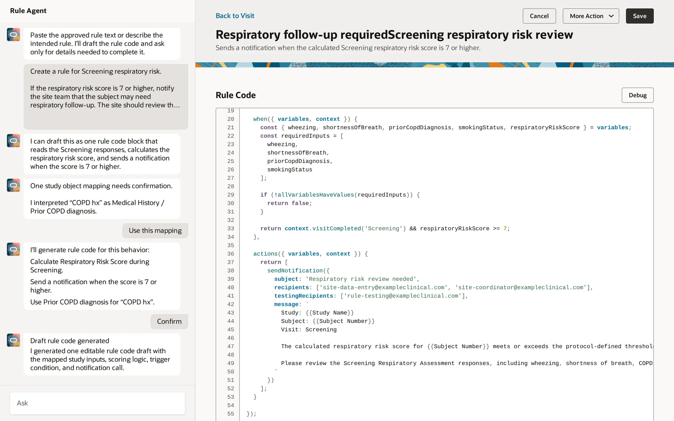
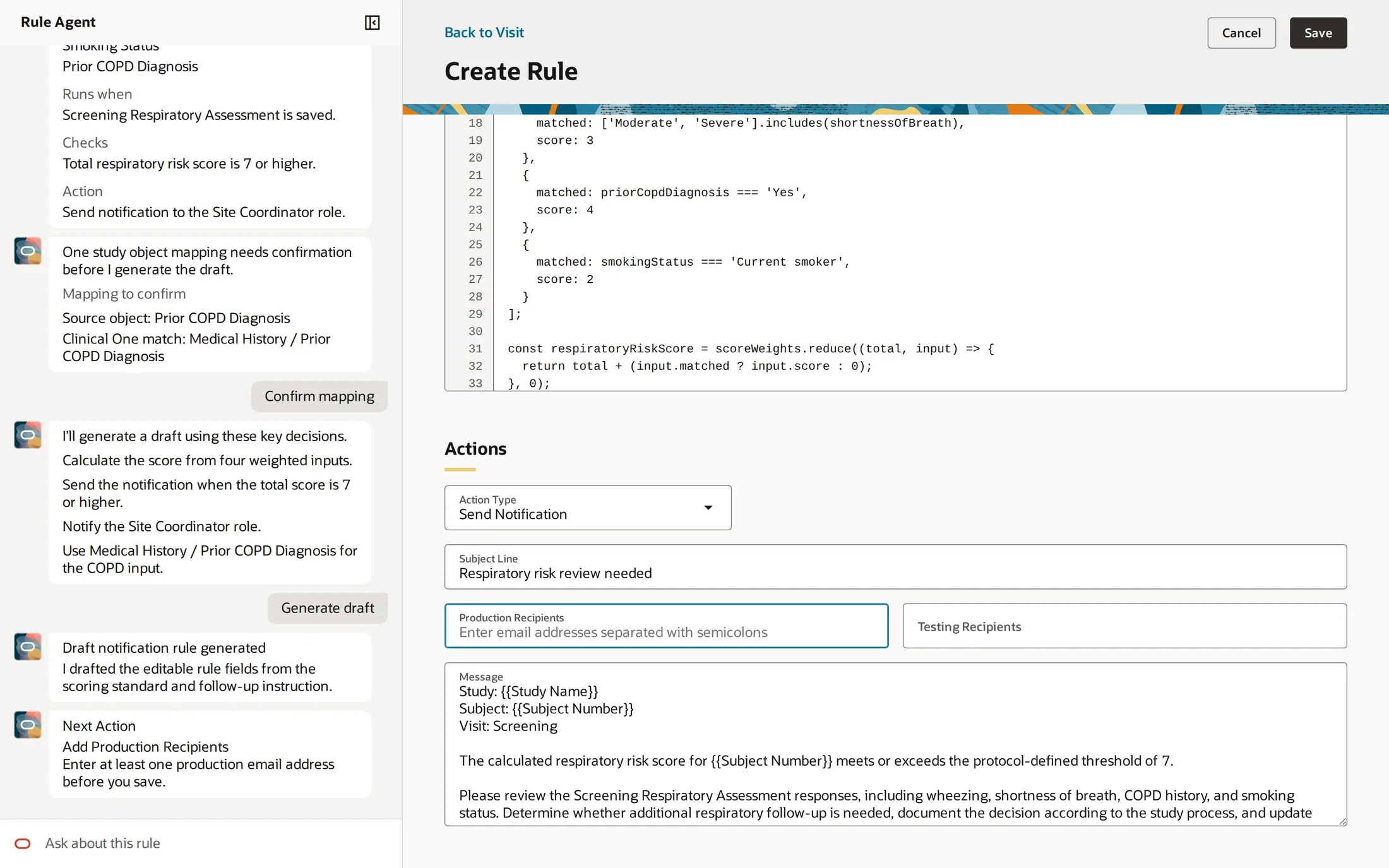
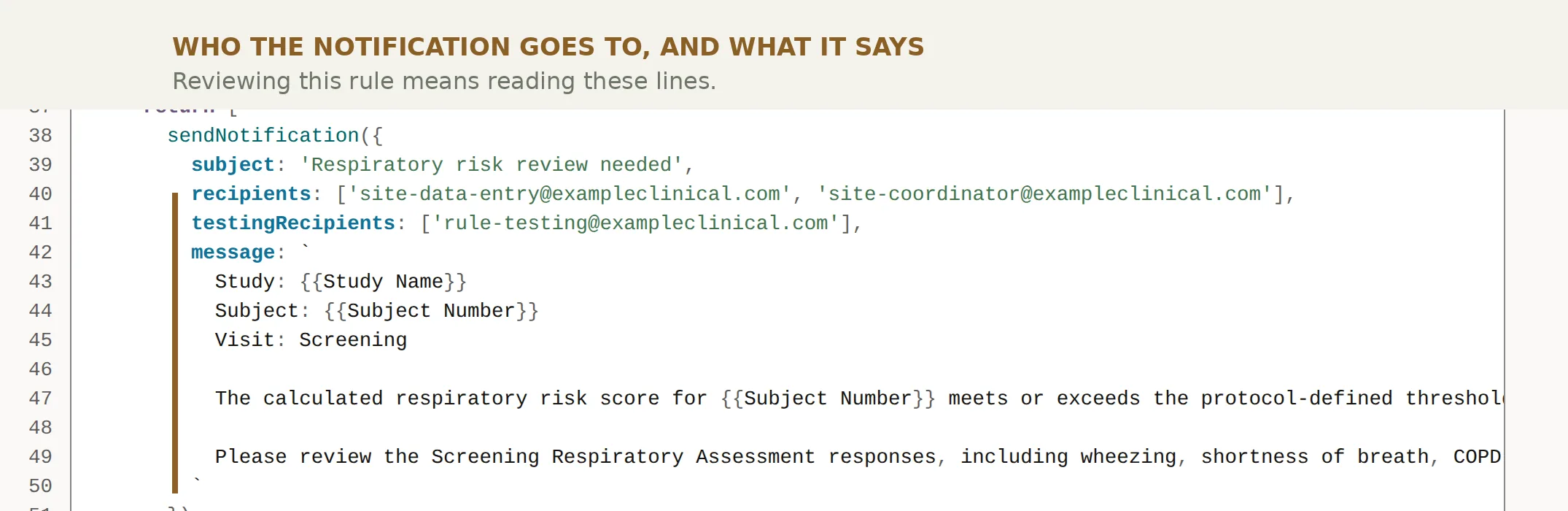
I argued against it, and the argument is in those two screens.
Selecting data, choosing an action type, naming recipients, writing the message — a Study Designer could already do and check all of that without reading code. Those are the reviewable parts of a rule.
Moving them into the code block does not make the rule simpler. It makes the only readable parts unreadable, for the exact people the assistant exists to help.
The compactness is real, and it is worth something — to people who were never blocked in the first place.
Those controls are the product's, not mine. What I contributed was the case for keeping them once an assistant started filling them in. The team settled there: the editor stays, the assistant becomes an optional way into it, and the condition is still code.
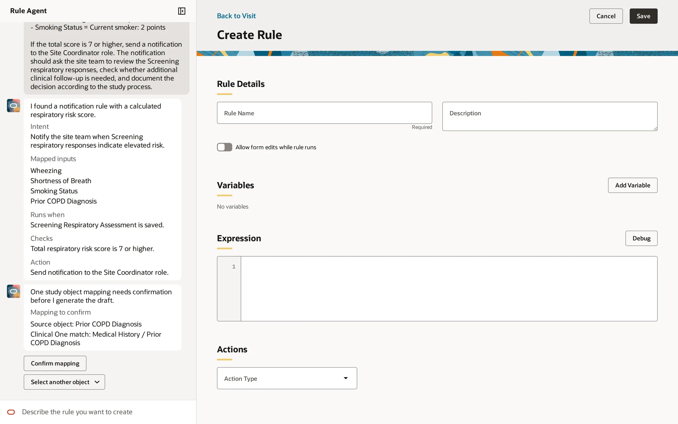
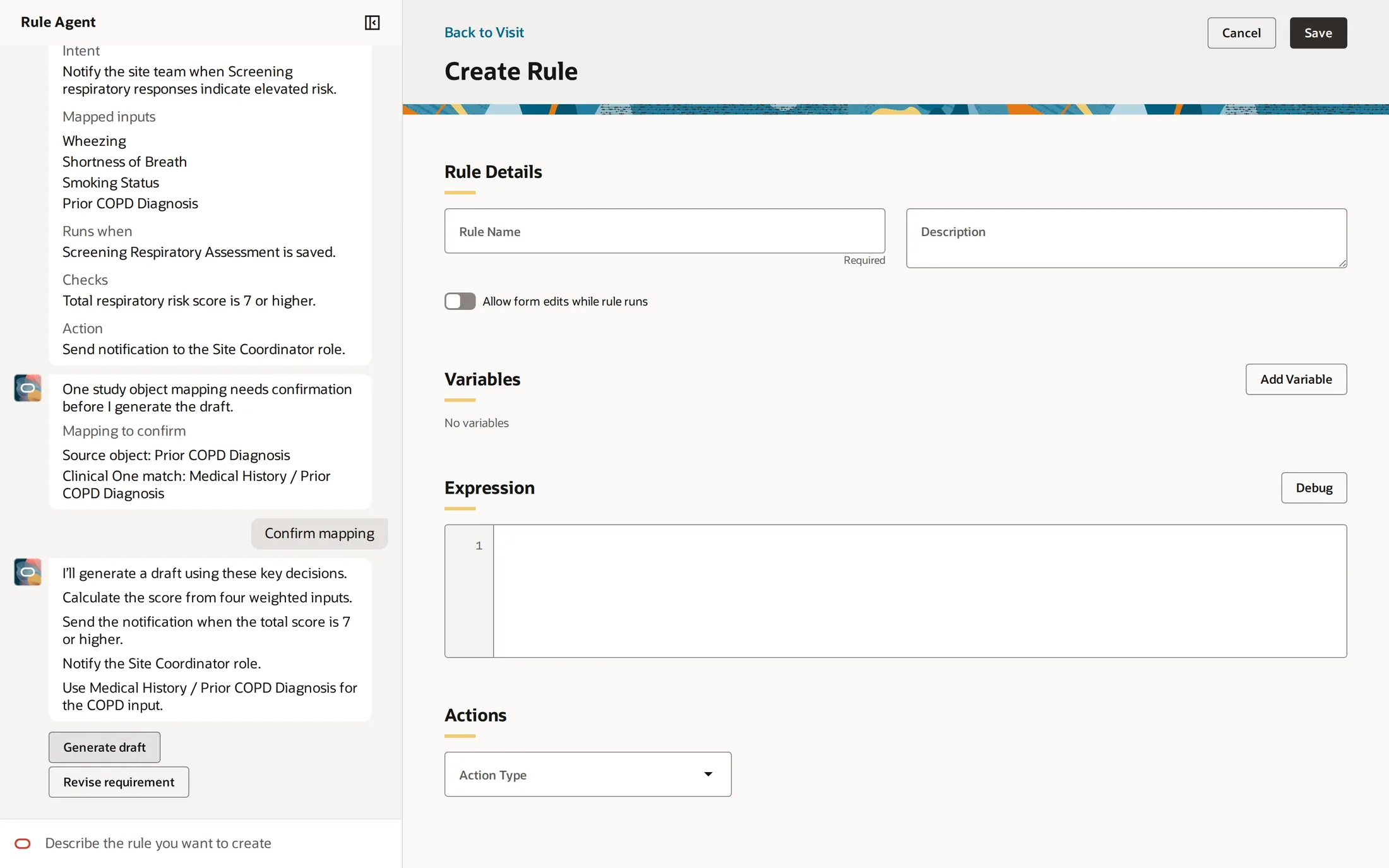
The full testing workspace did not ship. The checkpoints did — smaller, folded into a panel beside the editor instead of a workspace of their own.
Reviewing a rule's configuration is not the same as verifying its behavior, and I would not claim otherwise. But it kept the moments where a person is asked to agree with something specific, instead of being asked to approve a result.
The method
When the assistant should explain itself, and when it should stay quiet
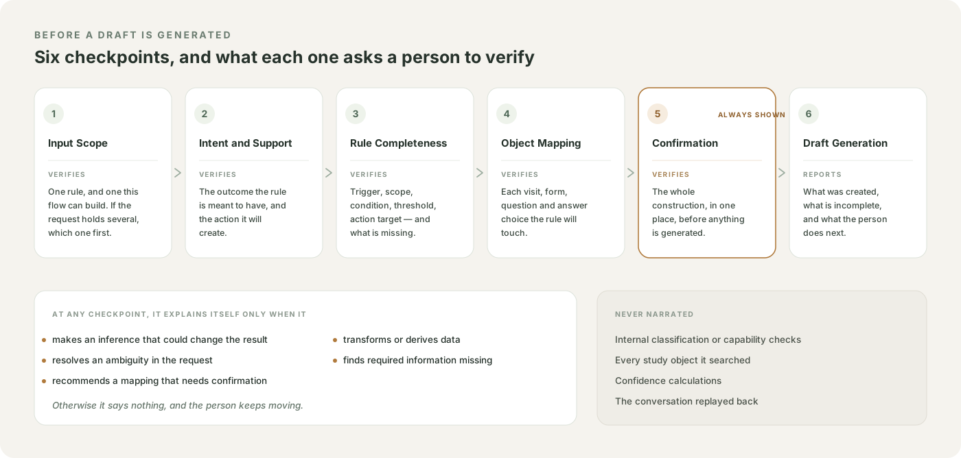
Designing the screens was not enough. The same screen helps or wastes your time depending on when the assistant decides to speak, so I wrote that rule down separately.
Explanation belongs inside the flow, and it exists to help someone check or correct the rule — not to expose the model's reasoning.
That gives every checkpoint a test to pass. Say more only when the assistant makes an inference that could change the result, settles an ambiguity, recommends a match, transforms data, or finds something missing. Otherwise say less.
Listing every capability it checked feels like transparency and works like noise. It buries the one sentence that actually needed a human decision.
The document also records where my own design fails that test. At the confirmation step the assistant says it will "calculate the score from four weighted inputs" — which reads fine and cannot be checked. It is written down as an open question, not a solved one.
Closing
What I take from it
I designed the experience for understanding and testing an AI-generated rule, then worked with product and engineering on what could fit in a release much smaller than the design.
The contribution I would defend is not a screen. It is that at every stage, including the smallest one, there was a specific thing a person could disagree with — a sentence, a match, a decision, a result — instead of a finished artifact to approve.
The Epic had entered development when I last worked on it. I have no adoption or outcome data to report.
The question it left me with is still open: once AI produces the work, what does the person accountable for it need in order to know what they are accepting?